A case study:
Control4
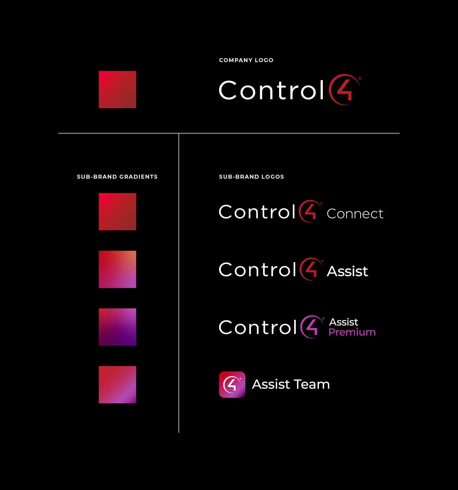
With the introduction of Connect, Assist, and Assist Premium the Control4 brand was expanding to showcase additional sub-brand logos. These new logos all align to brand standards, but because all of the marks are the same color and font, they all visually blend together. So how do we create differentiation, recognition, and heirarchy within the brand without diverting from the brand standards?
We turned to the existing Control4 brand color palette for ways to create on-brand variety, but felt restricted with no colors besides the shades of red. This seemed like a good place to start.

Proposed palette
After what felt like weeks of having too many color combinations renting a large space in my mind, I narrowed it down to this final option with the head of the creative team. Together, we discussed simplifying the existing palette by getting rid of the darker C4 grey. When we paired reds with this grey, it would mute the boldness of the reds. But when paired with a stark black, the reds really sing.
A lot of work and experimenting went into the selection of the tertiary palette. The tertiary colors were selected based on how they meshed in a gradient with the Control4 primary red. By always anchoring them to the brand’s main red, we would be aligning ourselves to the existing Control4 brand’s voice and aesthetic.

Start with a calm sense of purpose
It was important to start with the “why” behind what I was about to show the VP’s and stakeholders of Control4. I wanted to create a sense of security, assuring them that not much was going to change in the overall look and feel of their brand. I also wanted to give some insight to the strategy and value behind adding a tertiary palette to their brand guidelines before overwhelming them with unfamiliar colors.

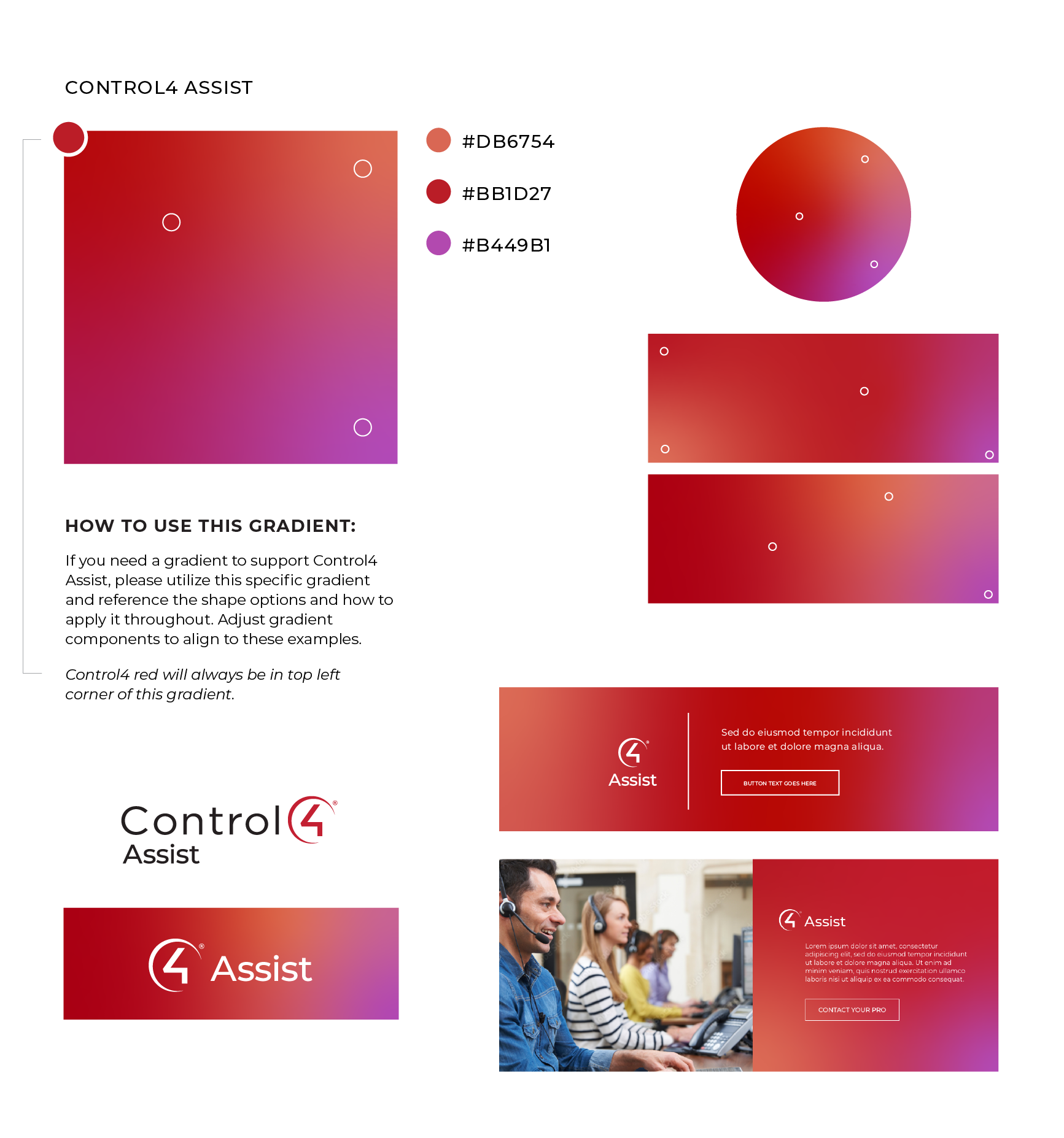
Cohesion and differentiation with gradients
The brand was already using gradients with their primary and secondary reds. We decided to create gradients that would be associated with each new sub-brand, using the brand’s reds and new tertiary palette. We aligned with the existing look and feel of the brand by prioritizing consistent placement of the Control4 primary red in each gradient.

-
![]()
Control4
-
![]()
Control4 Assist Team
-
![]()
Control4 Assist
-
![]()
Control4 Assist Premium


A new system
Not much has changed, but just enough to enable differentiation amongst all of these similar sub-brand logos. It is important to note the difference in colors between the Assist vs Assist Premium logos. Because these are both customer support plans, I wanted to use to color to visually create association and then use this association to signify a higher tier of customer experience.

“…Mandy has a remarkable skillset in both traditional and digital design. She possesses a deep understanding of color theory, typography, and layout, which is evident in the branding work she did for Control 4. Whether it's designing a logo, creating a website, or developing marketing materials, Mandy’s work is visually appealing and meticulously crafted.”
——Phil Hunter, Creative Services Director for Snap One
Visualizing value
The table and imagery shows how we are using the different colors of Assist and Assist Premium to signify a higher value/top tier customer experience. Purple is notably the color of royalty, and commonly associated with wealth, wisdom, and protection. The richness of the purple contrasts and elevates the Control4 red, but does not overpower it.

Plans at play
I created this mockup to show how we could utilize this new color and gradient system to both simplify and elevate the customer’s Control4 app experience.

Creating variety within a brand
Before the tertiary palette, the only colors in the Control4 brand palette were shades of red. This was incredibly limiting, especially for things that required colors to differentiate content and data. Many departments were using whatever colors they wanted to because there were no options or structure in place. Here you can see the tertiary palette in play, and how the strategic addition of colors can create more structured versatility within a brand.
